The cultivation of an elegant home extends far beyond simple utility; it is a profound journey into defining your space’s visual and psychological identity. As we cross major milestones in life, our relationship with our living environments undergoes a radical shift. The transient, fast-fashion interior trends that felt exciting in our twenties—characterized by mass-produced plastic decor, neon accent walls, or cold, unyielding minimalism—begin to lose their luster.
There arises a collective desire to curate a sanctuary that feels genuinely grown-up, polished, and uncluttered, yet deeply personal and rich with storied character.
     [ THE DECOR EVOLUTION MATRIX ]

     THE GENERATIVE TWENTIES:           THE SOPHISTICATED THIRTIES+:
     ┌────────────────────────┐        ┌────────────────────────┐
     │ ❌ Hyper-Trendy Neon   │        │  Desaturated Jewel Tone│
     │ ❌ Disposable Plastics │   VS   │  Organic Textures      │
     │ ❌ Sterile "All-Beige" │        │  Cohesive Core Palette │
     └────────────────────────┘        └────────────────────────┘
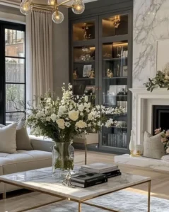
Too often, the fear of making a space look juvenile or chaotic drives people into the arms of radical neutrality. The result? Entire apartments bathed in an endless sea of builder-grade beige, sterile off-white, or cold millennial gray. While safe, this over-reliance on stark neutrality can leave a home feeling flat, clinical, and completely detached from the vibrant personality of the person who lives there.
True sophistication lies not in the total avoidance of color, but in its masterfully disciplined application. You can easily achieve an atmosphere of quiet luxury on a realistic budget, proving that an air of elegance is never tied to high expenditures, but is instead built through deliberate, sensory choices.
How Can Women 30+ Introduce Elegant Color Beyond Neutrals on a Budget?
Evolving your decor from a collection of functional objects into a cohesive, mature aesthetic requires moving past transient fads to embrace the intentionality of a boutique hospitality layout. The primary goal is to strike an exquisite balance between visual polish and emotional comfort—crafting a home that promotes deep rest, offers a sense of refuge, and supports your daily lifestyle with understated grace.
   [ THE REFINED VISUAL HIERARCHY ]

   =============================================
   [ CORE ACCENT NODE ] (Olive / Plum / Rust)    <── High-Impact Visual Anchors

   =============================================
   [ STABILIZING FOUNDATION ] (Taupe / Greige)   <── Non-Chaotic Backdrop Canvas

   ┌─────────────────────────────────────────┐
   │ [Tactile Texture]    [Polished Metal]   │ <── Subtle Sophistication Elements
   └─────────────────────────────────────────┘
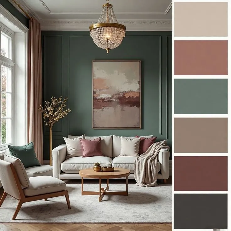
The Power of Desaturated Palettes
To introduce color without sacrificing a drop of sophistication, look to rich, desaturated, or “muddy” palettes. These hues contain strong gray, brown, or black undertones, which instantly strip away any harsh brightness, leaving behind a complex, mature color story.
Instead of primary greens or bright purples, look to the quiet luxury of deep olives, muted plums, and warm terracottas.
- Deep Olive: Evokes a sense of grounded tranquility and historical permanence, acting almost as a secondary neutral.
- Muted Plum: Introduces an intellectual elegance and moody romance that feels incredibly cozy in evening light.
- Warm Terracotta: Brings an inviting, earthy comfort that infuses an immediate sun-baked warmth into chilly or North-facing rooms.
Building the Non-Negotiable Neutral Base
The successful integration of these rich accent colors relies entirely on a well-established neutral foundation. Think of your neutral base as an architectural canvas; it exists to stabilize the room, preventing your accent colors from feeling chaotic or visually overwhelming.
   [ THE TEXTURAL ANCHOR LAYER ]

   ┌────────────────────────────────────────┐
   │ LAYER 1: Deep Accent Textile (Velvet)  │
   ├────────────────────────────────────────┤
   │ LAYER 2: Stabilizing Base (Taupe Wall)  │
   ├────────────────────────────────────────┤
   │ LAYER 3: Organic Contrast (Raw Wood)   │
   └────────────────────────────────────────┘
Warm grays, rich taupe, crisp off-whites, and soft creams offer a serene backdrop that ensures your deep accents look deliberate and highly polished. For example, a taupe wall provides the ultimate baseline for a muted plum velvet cushion to pop, while an off-white sofa gains instant style points when paired with deep olive green linen throws. This equilibrium allows your home to feel styled and personal without ever slipping into trendy excess.
Deconstructing the Sophisticated Palette Matrix
To apply these principles with absolute precision, utilize this structured color architectural matrix to guide your budget-friendly upgrades:
Master Sophisticated Color Palettes
| Primary Accent Color | Complementary Neutral Base | Suggested Secondary Accent | Spatial Mood & Application |
| Deep Olive | Warm Taupe / Soft Cream | Burnished Bronze / Soft Gold | Grounded tranquility; ideal for living rooms and entries. |
| Muted Plum | Light Gray / Crisp Off-White | Charcoal / Antiqued Silver | Intellectual elegance; perfect for bedrooms and intimate dens. |
| Warm Terracotta | Soft Beige / Pale Greige | Dark Walnut / Matte Black | Earthy comfort; injects life into dining zones and kitchens. |
| Dusty Blue | Cool Gray / Pure Alabaster | Pewter / Natural White Oak | Serene clarity; excels in bathrooms and home workspaces. |
| Sage Green | Creamy White / Oatmeal | Raw Brass / Earthy Umber | Organic rejuvenation; creates a spa-like rest sanctuary. |
Practical, Budget-Friendly Strategies for Infusing Color Elegantly
Achieving a high-end look on a real-person budget means prioritizing strategic expenditures that deliver maximum visual impact. Rather than executing an expensive, full-room overhaul, focus your budget on low-cost, high-yield tactile shifts.
   [ THE MATERIAL VALUE ELEVATOR ]

                 /\
                /  \     TIER 1: Tailored Linen Blend Drapes (Visual Height)
               /────\
              /      \   TIER 2: Rich Velvet / Brushed Cotton Accents
             /────────\
            /          \ TIER 3: Tactile Low-Pile Natural Fiber Area Rugs
           └────────────┘
1. Architectural Textiles: Texture Meets Hue
Textiles are your most powerful tool for introducing sophisticated color because they simultaneously inject texture, depth, and physical warmth into a space. When sourcing soft furnishings on a budget, prioritize materials that inherently convey luxury—such as linen blends, rich velvet, and brushed natural cotton. Synthetic, high-shine polyesters often look cheap and unrefined under room lighting; natural fibers absorb light beautifully, giving the color a deeper, more expensive look.
- Window Architecture: Hanging floor-to-ceiling linen curtains in an earthy olive green or dusty blue instantly alters the architecture of a room, framing your windows and adding sweeping vertical lines.
- Furniture Revitalization: Instead of investing thousands in a new sofa, swap out your existing cushion covers for deep sapphire, charcoal, or plum velvet options. This instantly updates the piece while integrating it into your broader color strategy.
2. Oversized Art & Accessory Curation
Art and tabletop accessories serve as incredible conduits for color, but they must be deployed with strict restraint. A common budget pitfall is scattering dozens of small, cheap trinkets across every surface, which instantly results in a cluttered, juvenile look.
   [ THE VISUAL SCALE FACTOR ]

   ❌ CONGESTED CLUTTER LOOK:         O SMART OVERSIZED LOOK:
   ┌────────────────────────┐        ┌────────────────────────┐
   │ 📷 📷 📷 📷 📷 📷 📷   │   VS   │  ┌──────────────────┐  │
   │ (10 Tiny, Cheap Frames)│        │  │                  │  │
   └────────────────────────┘        │  │  One Huge, Clean  │  │
                                     │  │  Gallery Frame   │  │
                                     │  └──────────────────┘  │
                                     └────────────────────────┘
- The Oversized Anchor: Source a single, large-scale abstract print featuring your chosen mature color palette (e.g., warm terracottas mixed with pale greige). Pop it into an inexpensive, clean-lined gallery frame. This single focal point draws the eye, grounds the entire room’s color story, and screams luxury.
- The Curated Vignette: Group smaller accessories tightly together rather than spreading them thin. Arrange a minimal cluster of matte ceramic vases in varying heights and shades of your accent color, or style an intentional stack of hardcover design books with colored spines on your coffee table.
3. Renter-Safe Structural Transformations
If you are managing a rental property or prefer non-permanent updates, you can still infuse bold, sophisticated color without risking your security deposit.
- Peel-and-Stick Accentuation: Utilize premium, renter-safe temporary wallpaper to create a rich accent wall behind your bed or inside a shallow entryway niche. Look for deep botanical greens, moody charcoals, or understated, desaturated geometric patterns.
- Tactile Layering with Rugs: Define your activity zones by layering your floor coverings. Lay down a large, budget-friendly neutral base rug made of natural jute or sisal, then layer a smaller, richly colored, or vintage-patterned low-pile wool blend rug directly on top. This anchors your furniture groupings while introducing gorgeous texture and color underfoot.
4. Hardware Customization & Thrifted Elegance
Never underestimate the power of finishing details to elevate existing furniture and make budget pieces look custom-tailored.
   [ THE HARDWARE UPGRADE DETAIL ]

   ┌────────────────────────────────────────┐
   │ BEFORE: Standard, Generic Plastic Knobs │
   ├────────────────────────────────────────┤
   │ SWAP: Solid Brushed Brass / Matte Black│
   ├────────────────────────────────────────┤
   │ AFTER: Bespoke, Custom Designer Appeal │
   └────────────────────────────────────────┘
- Hardware Modernization: Swap out the standard, generic knobs or drawer pulls on your dressers, nightstands, or kitchen cabinets for sleek brushed brass, antiqued bronze, or matte black options. This minor investment echoes the metallic notes found in your lighting fixtures, tying the entire space together beautifully.
- The Discriminating Thrift Hunt: Thrifting is an exceptional avenue for budget color infusion, provided you shop with an editor’s eye. Look for unique vintage pottery in rich earth tones, mid-century wooden side tables with great structural bones, or secondhand frames that can be easily updated with a can of desaturated spray paint. These storied pieces add a layer of unique individuality that mass-produced items simply cannot replicate.
Mastering the Visual Laws: The Rule of Three and Lighting Design
To ensure your color infusion looks cohesive rather than accidental, you must execute your design using verified spatial layout formulas.
The Geometric Rule of Three
The “Rule of Three” dictates that design elements—including colors, shapes, and textures—are most visually pleasing and balanced when repeated in odd numbers throughout a visual field. When introducing a new accent color, ensure it appears exactly three times across the room to establish clear design intent.
   [ THE GEOMETRIC RULE OF THREE FLOW ]

                     [ POINT 1: Deep Olive Curtains ]
                                    │
                    ┌───────────────┴───────────────┐
                    ▼                               ▼
   [POINT 2: Velvet Sofa Cushion]     [POINT 3: Ceramic Table Vase]

   ▲ This triangle configuration guarantees cohesive, intentional design flow.
For example, if you introduce an elegant sage green:
- Deploy it first at a high vertical level via your window drapes.
- Repeat the hue at eye level on a velvet cushion resting on your sofa.
- Anchor it on a horizontal surface via a matte ceramic vase resting inside an entryway vignette.
This triangular repetition guides the eye smoothly through the space, making the color choice feel completely integrated and harmonious rather than isolated or random.
Lighting Engineering & Color Interaction
Lighting is the ultimate, invisible element that can make or break your color palette. The temperature of your light bulbs completely alters how a color behaves across the day.
   [ THE EMOTIONAL LUMINESCENCE SCALE ]

   CRISPER LIGHT (4000K+)       ❌ Cold, Washout, Clinical Environment
   ──────────────────────────────────────────────────────────────────
   WARM LIGHT (2700K-3000K)     O Rich, Deep, Cozy, Sophisticated Ambience
To maximize your mature color scheme, completely avoid cold, harsh, or clinical bright white bulbs (4000K+), which wash out undertones and make spaces feel sterile and unrefined. Instead, engineer your lighting using warm-toned bulbs ranging strictly between 2700K and 3000K. This warm luminescence coaxes out the rich, cozy, and inviting undertones of deeper hues like muted plum, deep olive, and warm terracotta, bathing your home in an expensive, high-end hospitality glow.
Evaluating Material Perceived Value
When distributing your decor budget, use this material value matrix to understand which budget-friendly alternatives yield the most luxurious look:
Impact of Material Choices on Perceived Value
| Product Category | Budget-Friendly Material Choice | Perceived Value Enhancement Strategy | Architectural Benefit |
| Window Curtains | Heavy Linen blends, thick woven cotton. | Hang high and wide; allow fabric to drape elegantly to the floor. | Adds immense tactile texture; visually elongates ceiling heights. |
| Cushions & Throws | Matte Velvet, brushed cotton, tight knits. | Opt for hidden zippers and heavy duck-feather inserts. | Delivers soft, rich visual depth; absorbs light beautifully. |
| Cabinet Hardware | Solid Matte Black, unlacquered or brushed brass. | Match sleek metallic finishes to your room’s light fixtures. | Instantly upgrades standard furniture to look bespoke. |
| Area Floor Rugs | Woven Jute, low-pile organic wool blends. | Layer a small vintage or colored rug over a massive neutral base. | Delivers grounding natural texture; isolates functional zones. |
Frequently Asked Questions
How can I prevent my home from looking messy or cluttered when adding color?
To completely bypass a cluttered look, focus your color choices on a few large, high-impact pieces—such as an oversized gallery-framed artwork, a pair of tailored linen drapes, or a significant throw blanket—rather than scattering dozens of small colored trinkets. Grounding these accents against a rock-solid neutral baseline like warm taupe or soft cream will naturally keep visual chaos at bay.
What exactly does ‘quiet luxury on a realistic budget’ mean for home decor?
Quiet luxury on a real-person budget is all about rejecting loud, flashy, logos or cheap, fast-fashion interior trends. Instead, it prioritizes a disciplined focus on high-quality natural textures, timeless furniture silhouettes, and deeply sophisticated, desaturated color palettes. It means spending your money intentionally on key touchpoints—like custom-feeling cushion covers or updated hardware—that elevate your entire space without breaking the bank.
Can I use highly saturated, strong colors without making my room feel overwhelming?
Yes, you can absolutely deploy strong colors safely by using them strictly as curated accents against a dominant neutral canvas. Introduce rich, deep tones through soft textiles, artwork, or single accent pieces, and always apply the geometric “Rule of Three” to ensure the color flows harmoniously through the space rather than jumping out aggressively.
How do I introduce color into a tiny apartment without shrinking the room?
In smaller footprints, restrict your palette to just one or two core accent colors. Apply these colors vertically using tall, narrow elements like floor-length drapes or vertical artwork to draw the eye up. Additionally, hang a sleek mirror opposite a window to bounce natural light around; this reflects your chosen accent colors beautifully while making the apartment feel twice as spacious.
What is the ‘Rule of Three’ and how do I use it with my favorite accent color?
The Rule of Three states that design elements are far more visually balanced and satisfying when arranged in odd numbers, specifically groupings of three. To use this with color, make sure your chosen accent hue appears in three distinct places and heights across the room (e.g., in your curtains, on a sofa pillow, and inside a table vase) so the color choices look entirely intentional and unified.
What type of light bulbs will make my sophisticated color choices look their absolute best?
Always specify warm-toned light bulbs tracking between a 2700K and 3000K color temperature. This specific spectrum wraps your rooms in a cozy, inviting atmosphere and brings out the rich, deep, and luxurious undertones of mature colors like olive, plum, and terracotta. Steer clear of clinical white lights, which flatten design dimensions and make colors look cheap.
Conclusion
Stepping away from an all-beige lifestyle doesn’t mean you have to embrace a chaotic explosion of color. By anchoring your home in a serene neutral base and layering in rich, beautifully desaturated accent tones through high-quality textiles, oversized art, and thoughtful detail upgrades, you can architect a living space that feels incredibly sophisticated, intentional, and tailored to your life. True design elegance isn’t about lavish budgets; it’s about the discipline of editing, curating, and creating a peaceful sanctuary you love waking up to every single day.
Master Curation Checklist:
- Embrace Muted Undertones: Select rich, complex, desaturated accent colors like olive, plum, and terracotta over bright primaries.
- Establish Your Baseline Canvas: Secure a calming foundation of warm taupe, greige, or soft cream to balance your accents.
- Prioritize Fiber Quality: Invest in natural, light-absorbing textiles like linen, matte velvet, and brushed cotton for premium depth.
- Apply the Rule of Three: Cross-pollinate your chosen accent color at three distinct points and levels within your room’s layout.
- Elevate Your Luminescence: Switch out cold, clinical bulbs for warm, inviting 2700K–3000K lighting profiles to enrich your color choices.
- Upgrade Finishing Details: Swap generic furniture pulls for heavy brushed brass or matte black hardware to unlock bespoke luxury.