Walk into a beautifully decorated living room and you feel it before you notice it — a sense of warmth, of intention, of someone who knows exactly who they are and how they want to live. And more often than not, the first thing creating that feeling is the color on the walls. Not the furniture, not the art, not even the lighting. The walls. They set the emotional temperature of the entire room before a single cushion is plumped or a candle is lit.
If you have been living with walls that are fine — that particular shade of off-white that came with the apartment and has stayed, unchallenged, for three years — or if you have been quietly dreaming of something more beautiful but are terrified of getting it wrong, this guide is written for you. Because here is the truth that interior designers know and rarely say out loud: choosing a sophisticated paint color for your living room is far less risky than you think, and the difference it makes to your daily life is far greater than you could possibly imagine.
The fear of paint color is almost always the fear of making something feel cold, stark, or clinical — the kind of space that looks beautiful in a magazine photograph but feels uninhabitable in real life. That fear is completely understandable. And it is also, with the right knowledge, entirely preventable. In this guide, you will learn exactly which colors create sophisticated warmth, which combinations feel timeless rather than trendy, and how to make any room feel like a genuine expression of the woman you are. Ready to fall in love with your living room walls? Let’s start from the beginning.
Why Wall Color Is the Most Powerful Decorating Tool You Have
Before we talk about specific colors, let’s establish something important: wall color is, square foot for square foot, the single highest-impact decorating decision you will make in any room. The walls cover more surface area than any other element in the space. They are present in every sightline, every photograph, every moment you spend in the room. They are the backdrop against which every piece of furniture, every artwork, every plant, every lamp is seen.
This means that a paint change — which costs a fraction of what new furniture costs and can be accomplished in a weekend — has the power to make an entirely new room out of the same space. The sofa you were considering replacing? It may look completely different, completely fresh, completely right against a new wall color. The art you thought felt lost? It may suddenly sing. The wooden floors you take for granted? They may warm up in ways you never noticed before.
Wall color also does something that no other decorating element does: it changes the perceived size, height, and shape of a room. Darker colors bring walls closer, creating intimacy. Lighter colors push walls out, creating airiness. A ceiling painted the same color as the walls makes the room feel taller. A horizontal color band around the room makes it feel lower and more grounded. Understanding these principles gives you genuine power over your space, regardless of its actual dimensions or the constraints of renting versus owning.
The Fear of Color: Why So Many Living Rooms Stay Beige
Let’s talk honestly about why so many of us default to white or beige — even when we know, deep down, that we want something more. It is almost never because we actually love beige. It is because we are afraid of committing to the wrong thing, afraid of a color that will date quickly, afraid of a room that will feel oppressive or dark, afraid of spending money on paint and having to live with a mistake.
These are completely legitimate concerns. But they rest on a misunderstanding of how sophisticated paint color actually works. A well-chosen rich color does not make a room dark — it makes it atmospheric. A carefully selected deep tone does not make a room feel small — it makes it feel intimate and enveloping. The rooms that go wrong are almost never the ones that were too bold. They are the ones that were bold in the wrong direction — too blue without warmth, too grey without depth, too stark without texture.
The goal of this guide is to give you the knowledge to be bold in exactly the right direction. Because the woman who decides to paint her living room walls a beautiful dusty terracotta, or a deep sage green, or a warm charcoal — and gets it right — never goes back to beige. Not because beige is wrong, but because she has discovered what it feels like to truly love her own walls. And that feeling changes everything about how she experiences her home.
Sophisticated vs. Cold: Understanding the Difference
What Makes a Color Feel Cold?
A paint color feels cold when it lacks warmth in its undertones. Blue-based whites, cool greys, stark bright whites, and pure blacks without red or brown undertones all tend to create rooms that feel clinical, sterile, or impersonal — beautiful in photographs, but uncomfortable to live in. Here are the specific factors that push a color toward coldness:
- Blue or green undertones without warm counterbalance — a grey with strong blue undertones feels like a hospital corridor under certain lighting conditions
- High reflectivity (very glossy finishes) — makes colors look starker and colder than they appear in the tin
- Too much contrast without warmth — brilliant white walls against dark floors without warm transitional elements reads as harsh
- Lack of layering — a cold room usually has one dominant color with nothing to soften it; warmth comes from layers of tone, texture, and material
- Cold artificial lighting — even the warmest paint color can feel cold under cool white LED lighting
What Makes a Color Feel Sophisticated and Warm?
Warmth in a paint color is created by the presence of red, yellow, or brown undertones — even in the subtlest quantities. A color can be quite dark, quite muted, or quite unusual and still feel warm and enveloping if these undertones are present. Here is what creates the combination of sophistication and warmth that defines truly elegant living rooms:
- Undertones of terracotta, umber, or ochre — even in a pale grey, a touch of yellow-brown makes the whole room feel grounded
- Medium to low sheen finishes — matte and eggshell finishes absorb light rather than reflecting it, creating depth and softness
- Intentional color layering — the wall color works with the floor, the ceiling, and the textiles to create a cohesive, warm tonal story
- Warm lighting — incandescent or warm-white LED bulbs (2700K–3000K) transform any paint color from cold to cosy
- Natural materials alongside — wood, linen, leather, rattan, and stone all warm up a paint color by introducing organic texture
| Designer’s Note The difference between a cold and warm version of the same color is often invisible in the paint store but overwhelming once it’s on the walls. This is why testing paint samples in your specific room, under your specific lighting, at different times of day, is absolutely non-negotiable before committing to a full paint job. We cover exactly how to do this in Section 10. |
The Best Sophisticated Paint Colors for Living Rooms
The following color families consistently deliver sophistication, warmth, and timeless elegance in living room applications. Within each family, I have included specific shades, brand references, and the rooms where they work best.
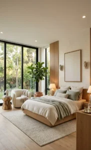
Warm Neutrals: The Foundation of Effortless Elegance
Warm neutrals are the category most underestimated by home decorators and most beloved by interior designers. These are not beiges. They are complex, layered, often faintly warm-toned colors that read as almost-neutral but carry enormous depth and character when they hit the wall.
| Warm Neutral Palette — Sophisticated Living Rooms | ||
| Color Name | Hex / Reference | Best Used For |
| Farrow & Ball Elephant’s Breath | F&B 229 | North or east-facing rooms, pairs beautifully with warm whites and natural wood |
| Benjamin Moore Pale Oak | OC-20 | South-facing rooms with abundant light — deepens to a gorgeous warm putty |
| Sherwin-Williams Accessible Beige | SW 7036 | Universal warm neutral — works in almost any living room, any orientation |
| Farrow & Ball String | F&B 8 | Rooms with warm wood floors — creates a seamless, layered tonal warmth |
| Benjamin Moore White Dove | OC-17 | Classic warm white — the most elegant ‘white’ in the palette, never feels stark |
| Sherwin-Williams Antique White | SW 6119 | Rooms with lots of natural light — deepens to a genuine warm cream in the evening |
The key to using warm neutrals effectively is layering. A warm neutral wall paired with natural linen curtains, warm timber furniture, a textured wool rug, and soft warm lighting becomes deeply beautiful. The same color against stark white trim, glossy surfaces, and cool lighting looks flat and uninspired. The wall color is only half the equation; what you pair it with is the other half.
Dusty Blues and Slate Greens: Depth Without Coldness
Here is where it gets exciting — and where most people’s color fear is most unnecessarily strong. Dusty, desaturated blues and slate greens are among the most sophisticated colors available for living rooms, and when chosen with warm undertones and paired correctly, they create rooms of genuine depth and refinement that feel anything but cold.
The key distinction is between bright, saturated blue (cold, primary, difficult to live with) and dusty, grey-toned, slightly muted blue (sophisticated, layered, timeless). The same principle applies to green: a vivid, saturated green is a very different experience from a soft, grey-green, or sage — which reads as almost neutral in some lights and deeply, beautifully colored in others.
| Dusty Blues & Slate Greens Palette | ||
| Color Name | Hex / Reference | Best Used For |
| Farrow & Ball Mizzle | F&B 266 | Subtle grey-green that shifts beautifully with natural light — perfect for south-facing rooms |
| Benjamin Moore Newburyport Blue | HC-155 | The most sophisticated dusty blue available — warm enough to feel cosy, cool enough to feel refined |
| Sherwin-Williams Sea Salt | SW 6204 | The ultimate safe dusty blue-green — warm undertones prevent any feeling of coldness |
| Farrow & Ball Oval Room Blue | F&B 85 | Sophisticated powder blue with grey undertones — extraordinary in rooms with good natural light |
| Benjamin Moore Branchport Brown | HC-72 | A warm slate grey-green that defies easy categorization — remarkably versatile |
| Sherwin-Williams Evergreen Fog | SW 9130 | Warm sage-grey — the most sought-after green of recent years, and for very good reason |
| Warmth Tip for Blues and Greens When using a dusty blue or slate green on the walls, introduce warmth through materials rather than fighting the color. Warm brass hardware, natural rattan, honey-toned wood, terracotta ceramic accessories, and warm amber lighting all beautifully counterbalance the cool tone of the wall and create rooms of extraordinary balance and elegance. |
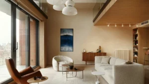
Moody Rich Tones: Drama Done Right
The most transformative — and most feared — category of living room paint colors is the deep, saturated, atmospheric tones: deep forest greens, rich charcoals, warm blacks, dusty plums, and chocolate browns. These colors do something that pale colors simply cannot: they make a room feel like a destination. A room you want to be inside. A room that wraps around you.
The fear around moody colors is almost always about darkness — that a dark wall will make the room feel oppressive or cavernous. This fear is significantly overblown. The rooms that feel oppressive are the ones where dark walls are combined with dark floors, no light reflection, poor artificial lighting, and no visual breathing room. Dark walls in a room with good artificial lighting, white or pale ceilings, reflective surfaces, and considered furniture placement feel dramatic and extraordinary — not oppressive at all.
| Moody Rich Tones Palette | ||
| Color Name | Hex / Reference | Best Used For |
| Farrow & Ball Hague Blue | F&B 30 | The definitive elegant dark blue — extraordinary in rooms with warm artificial light |
| Benjamin Moore Black Forest Green | 2047-10 | Deep, forest-dark green — creates rooms that feel like a sophisticated private library |
| Farrow & Ball Railings | F&B 31 | A near-black with navy undertones — the most elegant dark color in any palette |
| Sherwin-Williams Urbane Bronze | SW 7048 | Warm charcoal-brown — earthy, sophisticated, pairs brilliantly with warm brass and natural materials |
| Benjamin Moore Polo Blue | 2062-20 | Deep, rich navy that reads differently at every hour of the day |
| Farrow & Ball Pelt | F&B 254 | A warm, dusty plum — the most romantic of all the dark colors, exceptional in candlelight |
Essential rule for dark walls: Paint the ceiling either the same color (for a cocoon-like enveloping effect) or a very pale warm white (to reflect light downward). Never paint a ceiling in a contrasting mid-tone alongside a dark wall — the visual interruption is jarring and makes the room feel lower, not taller.
Soft Terracotta and Blush: Warmth with Sophistication
Terracotta, blush, dusty rose, and warm rust tones are having a genuine moment in sophisticated interior design — and for good reason. These colors carry an inherent warmth that no other family can match, a quality of catching light in the most flattering way possible, and a timelessness rooted in ancient Mediterranean architecture that makes them feel simultaneously contemporary and completely enduring.
The version of these colors to avoid is the bright, 1980s coral or the generic dusty pink of a child’s bedroom. The version to embrace is the sophisticated, slightly greyed, slightly darkened terracotta or blush that looks like a fresco wall in a Florentine palace — complex, warm, and deeply beautiful.
| Terracotta & Blush Palette | ||
| Color Name | Hex / Reference | Best Used For |
| Farrow & Ball Dead Salmon | F&B 28 | The most perfectly named and perfectly beautiful dusty blush — warm, refined, extraordinary |
| Benjamin Moore Caliente | AF-290 | Rich, warm red with terracotta depth — extraordinary with natural wood and warm brass |
| Sherwin-Williams Dusty Miller | SW 9107 | Soft, dusty terracotta — works beautifully in smaller rooms and north-facing spaces |
| Farrow & Ball Setting Plaster | F&B 231 | The most beloved blush-terracotta hybrid — warm, sophisticated, and genuinely timeless |
| Benjamin Moore Terra Mauve | 2173-40 | Warm dusty mauve — the most elegant version of the pink family |
| Sherwin-Williams Cavern Clay | SW 7701 | Warm terracotta that shifts from golden to pink depending on the light — magnificent |
Curated Color Palettes: 6 Complete Living Room Looks
A wall color never exists in isolation. Here are six complete, carefully curated palette combinations — each one a fully realized living room vision designed for different tastes, different room orientations, and different personal styles.
Palette 1: The Warm Minimalist
For the woman who loves clean lines but craves warmth and depth.
| Element | Color / Material | Why It Works |
| Wall | Sherwin-Williams Accessible Beige (SW 7036) in eggshell | Warm beige with subtle pink-brown undertones — never reads as dull |
| Ceiling | Benjamin Moore White Dove in flat | The warmest white — bounces golden light without glare |
| Trim | Benjamin Moore White Dove in semi-gloss | Unified warm white from ceiling to trim creates seamless elegance |
| Sofa | Linen or bouclé in natural oatmeal | Textural warmth that layers with the wall beautifully |
| Rug | Warm wool in caramel and ivory | Anchors the palette and introduces pattern without noise |
| Accents | Warm brass, aged oak, terracotta ceramic | These three materials together with warm beige walls create a timeless editorial look |
Palette 2: The Refined Green
For the woman who wants nature inside without sacrificing elegance.
- Wall: Sherwin-Williams Evergreen Fog (SW 9130) — warm sage-grey with extraordinary depth
- Ceiling: Crisp warm white — Farrow & Ball Pointing (F&B 2003) in flat
- Trim: Same crisp warm white in eggshell
- Sofa: Deep caramel leather or warm cognac velvet
- Rug: Vintage-style Persian in dusty reds, golds, and creams
- Accents: Antique brass, dark walnut, aged linen, ceramic in dusty terracotta
Palette 3: The Midnight Drama
For the woman who is ready to be bold and create a room that makes people gasp.
- Wall: Farrow & Ball Hague Blue (F&B 30) — rich, deep, extraordinary in warm light
- Ceiling: Same Hague Blue — creates a complete, enveloping room
- Trim: Farrow & Ball Pointing (warm white) — the contrast is crisp and architectural
- Sofa: Ivory or warm cream linen — the contrast is breathtaking
- Rug: Natural jute or warm sisal — texture over pattern in this palette
- Accents: Aged brass, warm gold, natural rattan, white ceramic, white candles
Palette 4: The Warm Terracotta Studio
For the woman who loves Mediterranean warmth and the feeling of golden afternoons.
- Wall: Farrow & Ball Setting Plaster (F&B 231) — the most beautiful terracotta-blush ever created
- Ceiling: Farrow & Ball Pointing or Estate Emulsion White Tie (F&B 1) — warm, not stark
- Trim: Same warm white as ceiling
- Sofa: Deep olive green velvet or warm moss linen — the green-terracotta combination is timeless
- Rug: Vintage Moroccan in creams and warm reds
- Accents: Hammered copper, dark iron, aged wood, hand-thrown ceramic
Palette 5: The Sophisticated Grey
For the woman who loves grey but has been burned by grey that looked blue or cold.
- Wall: Farrow & Ball Elephant’s Breath (F&B 229) — the warm grey that outperforms every other grey
- Ceiling: Farrow & Ball All White (F&B 2005) — pure but warm-white
- Trim: Same All White in eggshell
- Sofa: Soft blush or dusty rose velvet — extraordinary against warm grey
- Rug: Deep charcoal and ivory abstract or traditional pattern
- Accents: Rose gold, aged mirror, white marble, fresh green plants
Palette 6: The Elegant Blush
For the woman who loves a feminine aesthetic without the room feeling too sweet or too pink.
- Wall: Benjamin Moore Terra Mauve (2173-40) — sophisticated warm mauve, not pink
- Ceiling: Benjamin Moore Chantilly Lace (OC-65) — the crispest, most beautiful warm white
- Trim: Same Chantilly Lace in semi-gloss
- Sofa: Deep charcoal or warm chocolate brown — the contrast is stunning
- Rug: Cream and soft blush abstract or geometric
- Accents: Warm gold, dark espresso wood, dusty pink linen, aged mirror
The Accent Wall Strategy: Bold Without Full Commitment
If you love the idea of a rich, dramatic color but are not quite ready to commit all four walls, the accent wall is your most intelligent entry point. But the accent wall, done wrong, is one of the most dated and visually disappointing things you can do in a living room. Done right, it is transformative.
The right wall to accent: The wall your eye is drawn to naturally when you enter the room — usually the far wall, the fireplace wall, or the wall your sofa is positioned against. This is the wall that has the most visual weight in the room, and it is the wall that will benefit most from a rich, deep color.
The wrong walls to accent: A wall that is broken up by too many doorways or windows; a wall adjacent to an already busy area; the wall behind the television (which is already competing with the screen for attention).
The color strategy: Choose a color that is two to three values darker than your remaining walls. If the rest of the room is a warm white, the accent wall might be a beautiful warm terracotta, a deep sage green, or a rich navy. The accent wall and the main wall color should feel like they belong to the same family — harmonious, not jarring.
| Insider Tip For the most sophisticated accent wall effect, paint the accent wall in a flat or matte finish and the remaining walls in eggshell. The difference in sheen draws the eye to the accent wall and gives it a quality that feels intentional and gallery-like. |
How Finish and Sheen Change Everything
One of the most overlooked factors in paint selection is the finish — and it changes the experience of a color dramatically. The exact same paint color in a flat finish versus a semi-gloss finish looks like two entirely different colors in the room.
| Finish | Effect in the Room | Best Used For |
| Flat / Matte | Absorbs light; richest, deepest color expression; shows imperfections more | Feature walls, ceiling, older walls with texture; best for rich, moody colors |
| Eggshell | Slight sheen; hides minor imperfections; cleanable — the ideal living room finish | All main living room walls; the most flattering finish for sophisticated colors |
| Satin | Higher sheen; slightly more reflective; more washable than eggshell | High-traffic areas; walls in homes with children or pets; south-facing bright rooms |
| Semi-Gloss | Significant shine; very cleanable; shows every imperfection on the wall | Trim and molding ONLY — gives crisp architectural definition; never use on walls |
| High Gloss | Mirror-like; extremely reflective; looks dramatic but unforgiving | Rarely appropriate for walls; sometimes used as a lacquered accent in very small rooms |
For most sophisticated living rooms, the ideal formula is: eggshell on the walls, flat on the ceiling, and semi-gloss on all trim and molding. This combination creates the right amount of visual hierarchy — the ceiling recedes, the walls have warmth and depth, and the trim has crisp architectural definition.
What to Pair With Your Wall Color
Furniture and Upholstery
The relationship between your wall color and your furniture is the most important visual relationship in the room. Here are the principles that always work:
Warm walls + neutral furniture: The most reliable combination. A warm terracotta or sage wall paired with natural linen, oatmeal bouclé, or warm cream upholstery creates rooms that feel effortlessly elegant and completely livable.
Dark walls + light furniture: The most dramatic and sophisticated combination. Dark walls — Hague Blue, Railings, Black Forest Green — with ivory or cream sofas, natural jute rugs, and warm brass accents create rooms that look like they belong in an editorial shoot.
Muted walls + deep furniture: An underused but beautiful combination. Dusty sage or warm grey walls with a deep forest green, rich burgundy, or cognac leather sofa creates rooms of extraordinary sophistication and depth.
Textiles, Rugs, and Cushions
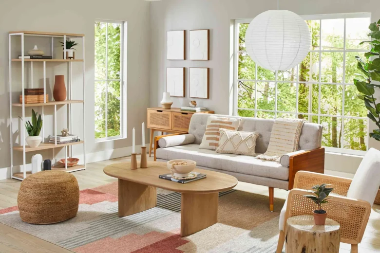
Textiles are the warmth amplifiers of any paint color. No matter how beautiful your wall color, a room without soft textiles will feel cold. Here are the most important principles for textile pairing:
- Introduce at least three different textures — smooth (velvet or leather), tactile (bouclé or boucle), and woven (linen or wool). The layering of textures creates visual warmth that paint alone cannot achieve.
- Your rug should contain at least one color from the wall and one from the furniture. This creates visual cohesion and makes the whole room feel intentional and complete.
- Cushions in two or three coordinating tones — never all the same color — create the kind of layered, considered look that distinguishes a decorator’s room from a showroom.
- Window treatments matter enormously. Floor-to-ceiling curtains in a fabric that relates to the wall color make every room feel taller, warmer, and more complete. When in doubt, choose curtains one or two shades deeper than the wall.
Lighting That Flatters Every Color
Lighting is the variable most people forget entirely when choosing paint color — and it is perhaps the most important variable of all. Paint color looks completely different under different types of lighting, and choosing the wrong light source can make a beautiful color look flat, cold, or simply wrong.
Always use warm white bulbs (2700K–3000K) in living rooms. This is non-negotiable for warmth. Cool white or daylight bulbs (4000K–6500K) will make even the warmest wall color feel clinical and cold.
Layer your lighting: ambient (overhead or recessed), task (reading lamps and table lamps), and accent (directed spotlights on artwork or architectural features). The layering of light sources creates depth and atmosphere that no single light source can achieve.
Candles are not optional: For sophisticated living rooms, the warm flicker of real candles during evening hours transforms any room regardless of its paint color. They are the single most cost-effective atmospheric enhancement available to any home decorator.
Dimmer switches: If you have any overhead lighting in your living room, install a dimmer switch. The ability to reduce the intensity of overhead light in the evening and rely on table and floor lamps instead is transformative for both the atmosphere of the room and the experience of the wall color.
Practical Guide: How to Test Paint Before You Commit
Every interior designer will tell you the same thing: never choose paint from a chip or an online swatch. The color chip is tiny, surrounded by white, and seen under the fluorescent lighting of a paint store — none of which bears any resemblance to how that color will look on your specific walls, in your specific light, at your specific hours of the day. Here is the correct process for testing paint samples:
- Purchase sample pots of two or three colors you are seriously considering — not fifteen, not twenty. Narrowing to two or three forces you to make real decisions.
- Paint each sample onto large sheets of white card or foam board — at least A3 / 12×16 inch size. Never paint directly onto the wall for testing, as the existing wall color will influence your perception of the sample.
- Position each sample board in different locations around the room — against the wall you plan to paint, near the window, near the door, on the floor next to your sofa. Observe how the color changes as you move it.
- Observe each sample at different times of day: morning with natural light, afternoon, and evening under your artificial lighting. A color that looks beautiful at noon may look completely different at 8pm.
- Live with the samples for at least three to five days before making your decision. You will feel the right answer more clearly than you think.
- Take photographs of each sample under different lighting conditions and look at them on your phone. Interestingly, photographs sometimes reveal color qualities — warmth, coldness, depth — that are harder to perceive with the naked eye.
| Time Investment Worth Making The sample testing process takes about a week and costs between $15 and $40. A full paint job on a living room costs between $200 and $800 in materials and potentially thousands in labor if professionally done. The week of testing is not a delay — it is the decision-making process that makes everything else certain. |
The Designer’s Checklist: 10 Rules for a Sophisticated Living Room
Before you pick up a paintbrush, run through this checklist to ensure every decision you make contributes to a room that feels genuinely refined:
- Choose your wall color last, not first — start with the fixed elements (floors, fireplace, built-in furniture) and let the wall color respond to them.
- Test samples in your actual room, in natural and artificial light, over at least three days.
- Always use warm white bulbs (2700K–3000K) — no exceptions for living rooms.
- Use eggshell finish on walls, flat on ceilings, semi-gloss on trim — this is the professional standard formula for a reason.
- Introduce at least three different materials alongside your wall color: one warm metal (brass, copper), one natural textile (linen, wool, cotton), one organic material (wood, rattan, stone).
- Paint your ceiling a warm white that relates to your wall color — never brilliant white against a warm wall.
- Hang curtains at ceiling height, not window height. This single change makes every room feel taller and more elegant.
- Add plants — green living plants warm up any wall color and add the organic quality that makes a room feel truly lived-in and beautiful.
- Edit ruthlessly — a sophisticated room has fewer, better things, not more things. Less furniture, more breathing room, better quality.
- Light candles every evening. This is not optional for the woman who wants a sophisticated home.
Conclusion
Your living room walls are the single largest canvas in your home — and right now, they may be waiting for something more beautiful. The journey from safe, uninspired paint to a color that genuinely moves you every time you walk into the room is shorter than you think. It starts with understanding what warmth actually means in paint color terms, continues with testing samples in your own light, and ends with a decision that reflects exactly who you are and how you want to feel at home.
The women who commit to a beautiful wall color — who choose the dusty sage, or the warm terracotta, or the midnight navy — consistently report the same thing: they cannot believe they waited so long. The room they were living in and the room they now inhabit feel completely different, even though almost nothing else changed. That is the power of paint color, chosen with knowledge and intention.
You deserve to love every room in your home. You deserve walls that make you feel something beautiful when you enter. Start with the samples. Trust the process. Trust yourself.
Frequently Asked Questions
1. Will a dark wall color make my living room feel smaller? Not necessarily — and often, quite the opposite. Dark wall colors create a sense of intimacy and depth that can actually make a small room feel more intentional and special, rather than cramped. The key is to pair dark walls with good lighting (both natural and warm artificial), a light or reflective ceiling, and furniture that creates visual breathing room. Many of the most celebrated small living rooms in interior design have deeply colored walls.
2. I rent my home and cannot paint the walls — what can I do? Removable wallpaper (also called peel-and-stick wallpaper) has improved dramatically in quality and now includes many sophisticated options in textured, printed, and solid colorways that can transform a renter’s living room without any permanent damage. Additionally, concentrating color through large-format artwork, deep-toned rugs, floor-to-ceiling curtains, and dark furniture against neutral rental walls achieves much of the same atmospheric effect as a paint color.
3. How do I choose between two colors I love equally? When you genuinely cannot choose between two colors, the decision should be made by lighting. Take your sample boards into the room at 7pm under your artificial lighting and observe which color feels warmer, richer, and more beautiful in that light. Evening is when you will experience your living room most — after work, during dinner parties, during evenings at home — so the color that performs best under artificial warm light is almost always the right choice.
4. Should the trim be the same color as the walls or white? For most sophisticated living rooms, white or warm white trim creates the crispest, most architectural effect and is almost always the most elegant choice. The exception is when you want a truly enveloping, cocoon-like room — in which case painting the trim the same color as the walls (or a shade deeper) creates a seamless, immersive effect that can be absolutely extraordinary. This technique is particularly beautiful in rooms painted in moody, rich tones like deep navy or forest green.
5. What is the most common paint color mistake in living rooms — and how do I avoid it? The most common mistake is choosing a paint color from a chip or photograph without testing it on large samples in your actual room under your actual lighting. The second most common mistake is choosing a grey that has blue undertones without realizing it — which reads as a cold, slightly clinical color on the wall rather than the sophisticated warm grey that was intended. Both mistakes are entirely avoidable with the testing process described in Section 10 of this guide.